
The Button tab controls how your floating chat button looks and where it appears on your website. You can customize the button’s style, icons, tooltip, and positioning for desktop, tablet, and mobile devices.
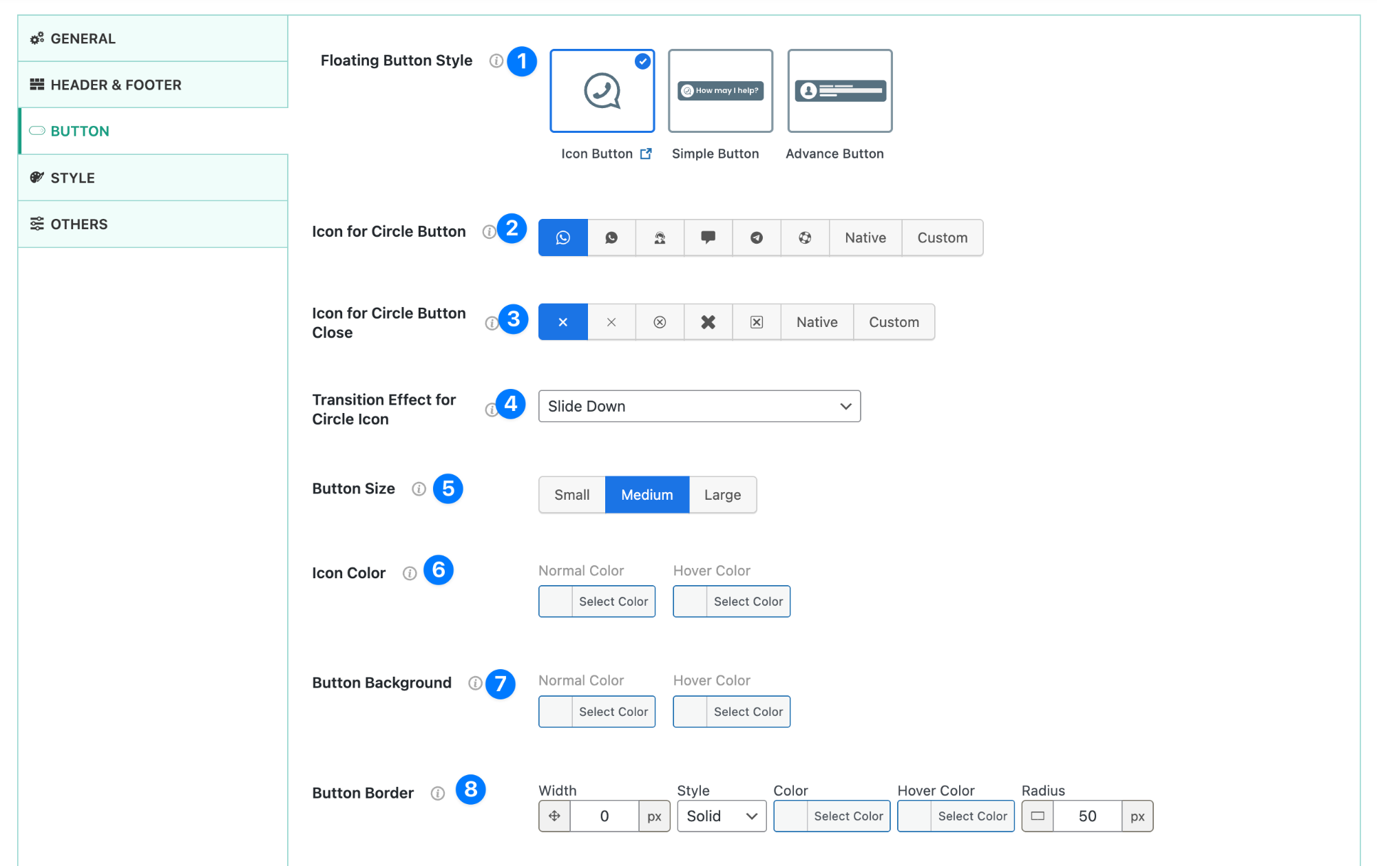
Icon Button (Minimal Floating Button) #
The Icon Button is the most lightweight floating option. It displays a single circular icon and is ideal for minimal or mobile-first layouts.
- Floating Button Style – Choose Icon Button to display a compact, circular floating icon.
- Icon for Circle Button – Select the icon shown inside the button. Options include WhatsApp, chat icons, native icons, or a custom uploaded icon.
- Icon for Circle Button Close – Choose the icon shown when the button is toggled or closed (for example, an “X” icon).
- Transition Effect for Circle Icon – Apply a subtle animation (such as slide down) when the button appears or changes state.
- Button Size – Set the icon size: Small, Medium, or Large.
- Icon Color – Control the icon color for normal and hover states.
- Button Background – Set the background color of the floating icon, including hover color.
- Button Border – Customize border width, style, color, hover color, and radius.
Simple Button (Icon + Text) #
The Simple Button adds a short text label next to the icon, creating a clearer call-to-action without becoming visually heavy.
- Floating Button Style – Select Simple Button to show an icon with a text label.
- Button Main Label – Set the primary text shown on the button (e.g. “How may I help you?”).
- Icon for Button – Choose an icon to display alongside the text, or disable the icon entirely.
- Icon for Button Close – Select the close icon shown when the button is toggled.
- Transition Effect – Apply a subtle animation effect when the button appears.
- Button Size – Adjust the overall button size.
- Icon Color – Control icon color for normal and hover states.
- Icon Background – Enable or disable a background behind the icon.
- Icon Background Color – Choose background colors for normal and hover states.
- Button Background – Set the main button background color.
- Button Label Color – Control text color for normal and hover states.
- Button Border – Fully customize border width, style, color, hover color, and radius.
- Icon Border – Fully customize border width, style, color, hover color, and radius.
- Button Padding – Adjust spacing inside the button for precise layout control.
Advanced Button (Avatar, Status & Trust Signals) #
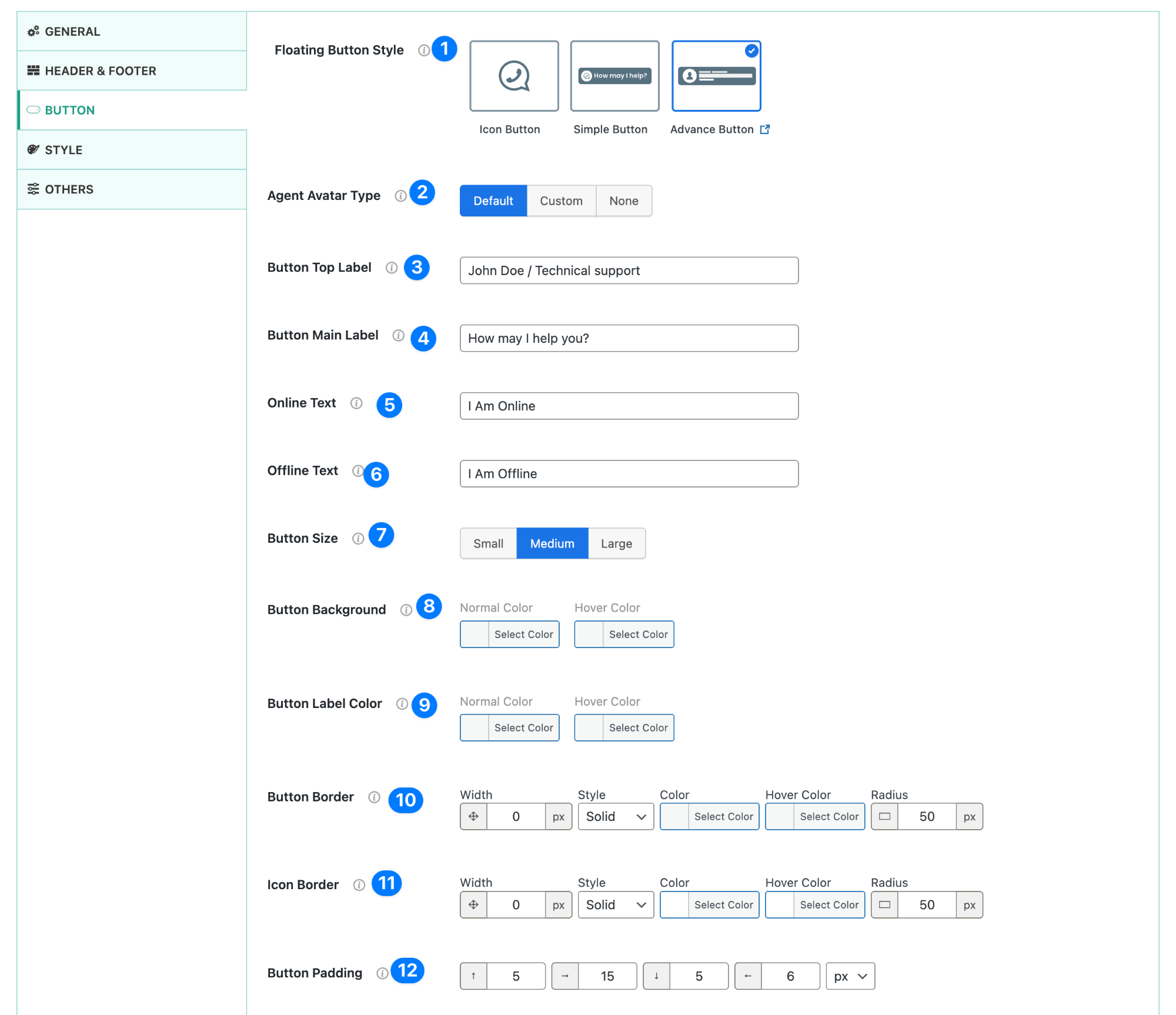
The Advanced Button is designed for maximum engagement. It supports agent avatars, status text, and layered labels to build trust before the click.
- Floating Button Style – Select Advanced Button.
- Agent Avatar Type – Choose a default avatar, upload a custom image, or disable avatars.
- Button Top Label – Add a short descriptor (e.g. agent name or role).
- Button Main Label – Set the main call-to-action text.
- Online Text – Text displayed when the agent is available.
- Offline Text – Text displayed when the agent is unavailable.
- Button Size – Control the overall button size.
- Button Background – Set background colors for normal and hover states.
- Button Label Color – Customize text color.
- Button Border – Adjust border width, style, color, hover color, and radius.
- Icon Border – Independently control avatar/icon border styling.
- Button Padding – Fine-tune spacing for balanced layouts.
Tooltip Settings #
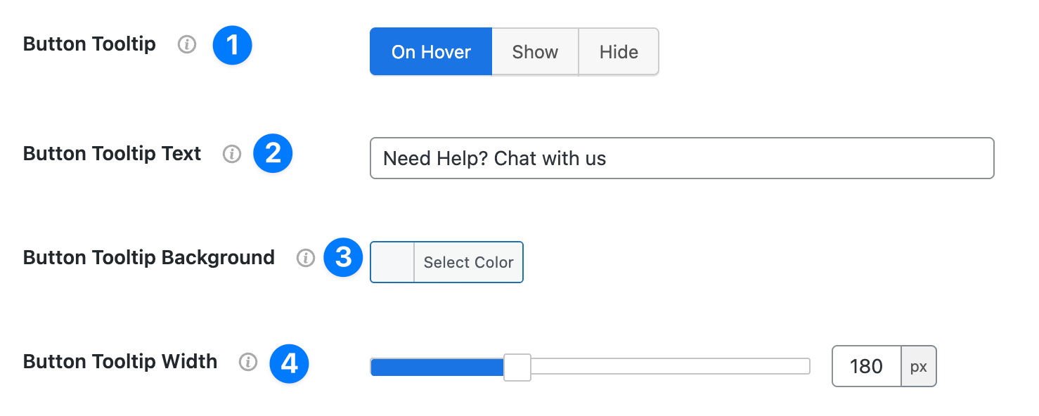
- Button Tooltip
- Controls when the tooltip text appears.
- Options: On Hover, Show, Hide
- Button Tooltip Text
- The text that appears inside the tooltip when users hover over or see the button.
- Example: Need Help? Chat with us
- Button Tooltip Background: Pick a background color for the tooltip for better visibility.
- Button Tooltip Width
- Adjust the width of the tooltip in pixels.
- Default is 180px (but you can expand or shrink).
Positioning (Desktop, Tablet, Mobile) #
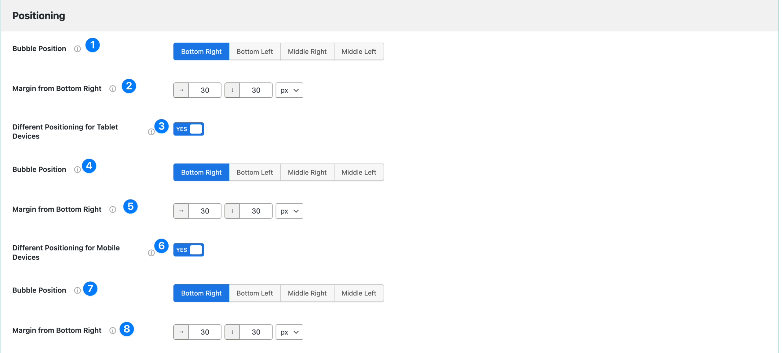
- Button Position (Desktop)
- Choose where the chat button appears on desktop.
- Options: Bottom Right, Bottom Left, Middle Right, Middle Left
- Margin from Bottom Right (Desktop): Set custom margins in pixels for spacing from the bottom and sides.
- Different Positioning for Tablet Devices: Toggle ON if you want to customize button placement separately for tablets.
- Bubble Position (Tablet): Select tablet-specific button placement (same options as desktop).
- Margin from Bottom Right (Tablet): Adjust spacing for tablets independently.
- Different Positioning for Mobile Devices: Toggle ON to configure mobile-specific button position.
- Bubble Position (Mobile): Choose where the button will appear on mobile.
- Margin from Bottom Right (Mobile): Fine-tune margins for smaller screens.
👉 This section ensures you can fully customize the floating chat button’s style and placement across all devices for better user experience.


