

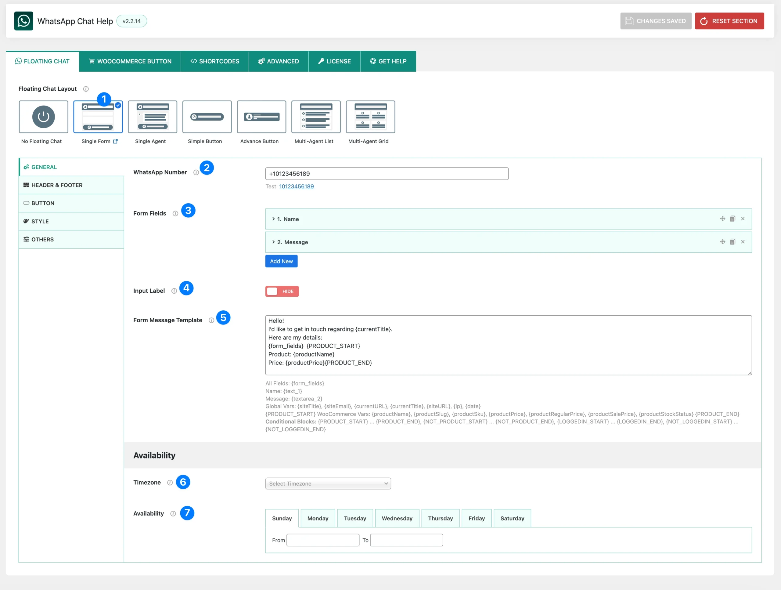
- Floating Chat Layout: Choose the layout type for your WhatsApp chat. Selecting Single Form enables you to display a floating chat bubble with a built-in form that users can fill out before sending a message.
- WhatsApp Number: Enter your WhatsApp number in international format (e.g., +10123456189).
This number will receive the messages submitted through the form. - Form Fields: Create and manage the fields shown in your form (e.g., Name, Email, Phone, Message).
- You can add unlimited fields.
- Supported field types: Text, Email, Phone Number, Textarea, Select.
- Each field can be customized with label, placeholder, required option, and validation message.
- Input Label: Toggle the visibility of field labels in your form.
- Show – Labels appear above each input (e.g., “Name”).
- Hide – Only placeholders are shown inside input fields.
- Form Message Template: Define the message template that will be sent to WhatsApp once the form is submitted.
- Use
{form_fields}to insert all field values. - Or insert specific variables like
{text_1},{textarea_2}for more control. - Supports Global Vars, WooCommerce Vars, and Conditional Blocks.
- Use
- (Useful for customizing WhatsApp messages with product info, page title, or logged-in status)
- Timezone: Select your timezone. This ensures that any time-based availability settings are shown to visitors correctly, even if their browser time is different from yours.
- Availability: Set when you or your agent is available.
- Configure From – To hours for each day of the week (Sunday–Saturday).
- Use
00:00 – 00:00to mark a day as completely offline. - Outside these hours, the chat form can display offline text instead.
Form Fields (Field Options) #
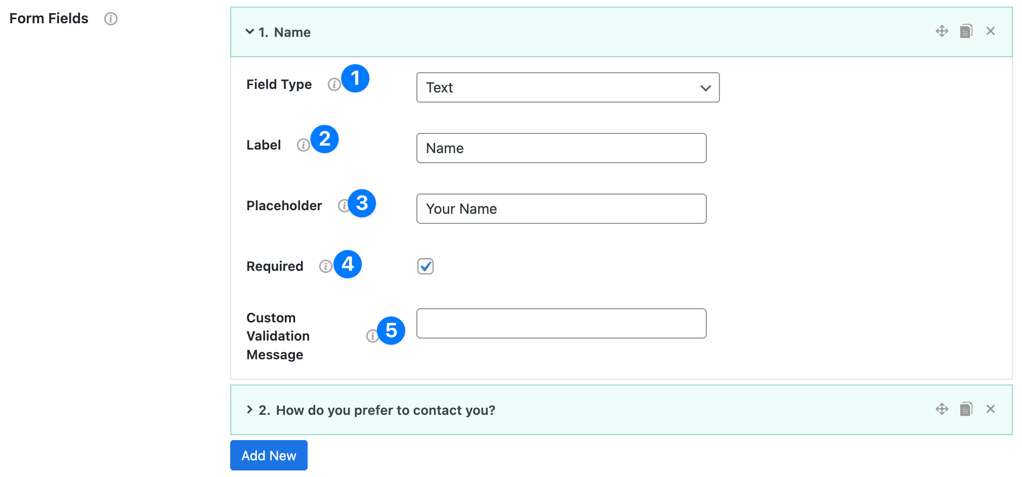
- Field Type: Choose the type of input you want users to fill. Available options:
- Text – short text (e.g., Name, Subject)
- Email – validates email format
- Phone Number – input for phone numbers
- Textarea – large input box for longer messages
- Select – dropdown menu with multiple options
- Label: The title of the field, shown above or beside the input. Example: Name, Email Address, Message.
- Placeholder: Hint text displayed inside the field, which disappears once the user types. Example: Your Name, Type your message…
- Required: Checkbox to mark the field as mandatory.
- Checked → users must fill it in before submitting.
- Unchecked → optional field.
- Custom Validation Message: Enter a custom error message that appears if users leave the field empty or enter invalid input. Examples:
- “Please enter your name.”
- “Email address is required.”
Select Field Options (special fields) #
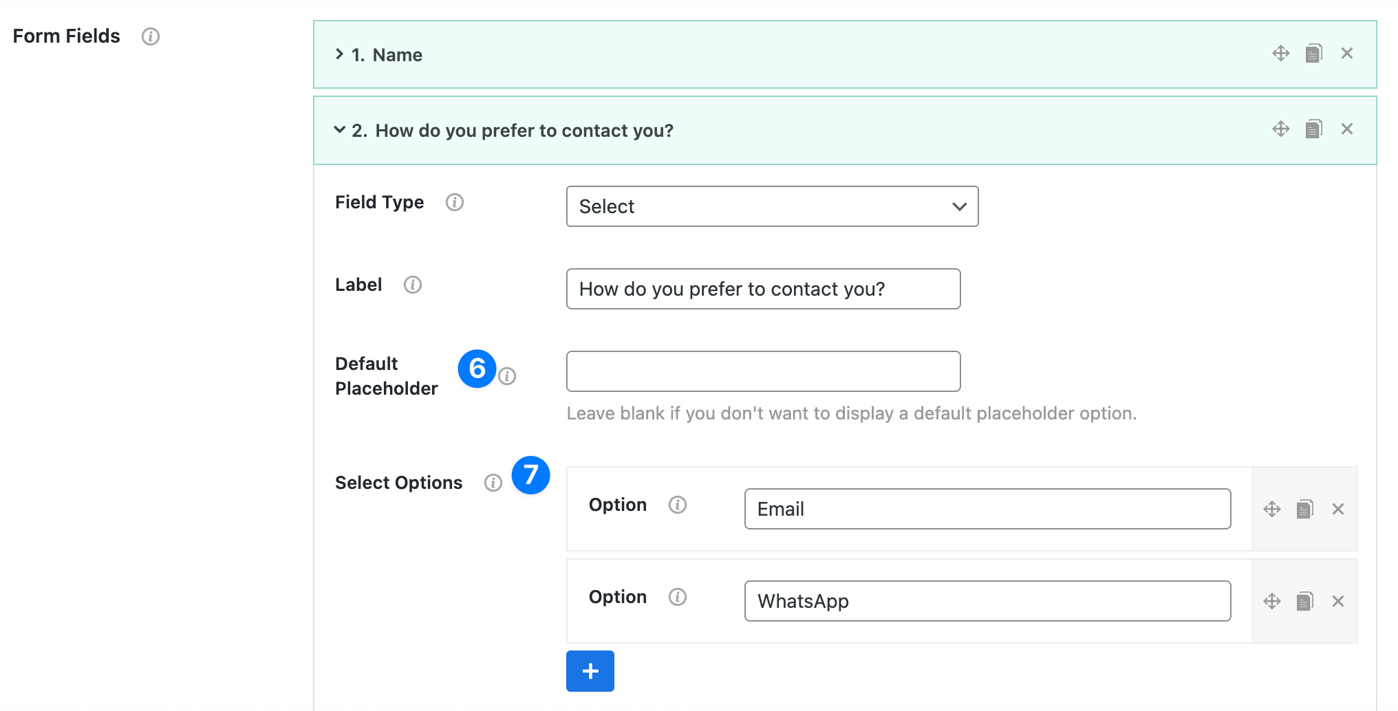
When you choose Field Type: Select, two extra settings are available:
- Default Placeholder: A non-selectable default option at the top of the dropdown. Example: “Select Option”, “Choose a Service”. 👉 Leave this blank if you don’t want a placeholder.
- Select Options (Repeater): Add multiple dropdown choices using the + button. Example:
- Phone Call
Users will see these values as selectable options in the form.
Dynamic variables reference #
All fields #
{form_fields}– Renders every form field as Label: Value on separate lines.
Specific fields (examples) #
Field IDs auto-increment by type/order. Common patterns:
- Text →
{text_1},{text_2}, … - Email →
{email_1}, … - Phone →
{phone_number_1}, … - Textarea →
{textarea_1},{textarea_2}, … - Select →
{select_1}, …
Tip: The variable for each field is shown beneath the editor after you add it.
Global vars #
{siteTitle},{siteEmail},{currentURL},{currentTitle},{siteURL},{ip},{date}
WooCommerce vars #
Wrap Woo data inside the product conditional block:
{PRODUCT_START} … {PRODUCT_END}
Inside it you can use:{productName},{productSlug},{productSku},{productPrice},{productRegularPrice},{productSalePrice},{productStockStatus}
Conditional blocks #
{NOT_LOGGEDIN_START} … {NOT_LOGGEDIN_END} – Only for guests.
{PRODUCT_START} … {PRODUCT_END} – Only shows content on product pages.
{NOT_PRODUCT_START} … {NOT_PRODUCT_END} – Only shows content on non-product pages.
{LOGGEDIN_START} … {LOGGEDIN_END} – Only for logged-in users.
Example templates #
A. Simple (all fields + page info)
Hello! I'd like to get in touch regarding {currentTitle}.
{form_fields}

Date: {date}
From: {siteTitle} – {siteURL}
B. Product-aware
Hello! I’m interested in {currentTitle}.
{form_fields}

{PRODUCT_START}
Product: {productName} (SKU: {productSku})
Price: {productPrice} • Regular: {productRegularPrice} • Sale: {productSalePrice}
Stock: {productStockStatus}
{PRODUCT_END}

{NOT_PRODUCT_START}
Page: {currentTitle}
{NOT_PRODUCT_END}

Date: {date} • IP: {ip}
C. Logged-in vs Guest
{LOGGEDIN_START}Customer is logged in.{LOGGEDIN_END}
{NOT_LOGGEDIN_START}Customer is a guest.{NOT_LOGGEDIN_END}
{form_fields}


