

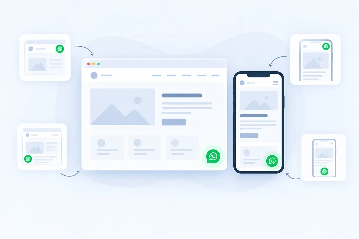

The WhatsApp button has been live for weeks. Analytics show almost nobody clicks it. The easy conclusion is “visitors don’t want WhatsApp” — but a button can be technically visible and still be easy to overlook, hidden behind another floating element, awkward on mobile, or simply missing from the moment a visitor actually has a question. This guide goes deep specifically on WhatsApp button placement; for the broader setup basics, see the WhatsApp chat button best practices guide.
WhatsApp button placement is really three separate decisions: where it sits on screen, where it appears inside your page content, and at which point in a visitor’s decision journey it shows up. Most sites only make the first one — “put a green bubble in the corner” — and stop there.
Best WhatsApp Button Placement: The Short Answer
- Floating: bottom-right is the safest starting convention on a left-to-right site.
- Product/pricing/service pages: add an inline CTA near the point where visitors are likely to hesitate or need clarification.
- Mobile: keep the button clear of sticky carts, consent banners, navigation, and device safe areas.
- Checkout: test carefully — hiding the floating button is often preferable when it competes with the primary purchase action.
This is a starting configuration, not a universal conversion law.
Key Takeaways
- Bottom-right is a sensible default on many LTR websites, but avoiding collisions with other fixed elements matters more than defending a particular corner.
- A floating button handles persistent access; inline WhatsApp CTAs work best near high-intent questions or hesitation points in the content itself.
- Mobile placement needs testing on real devices, since sticky carts, consent notices, and browser chrome can drastically reduce usable space.
- Placement should follow page intent — product, pricing, and service pages deserve different treatment than checkout or legal pages.
- A newly-appearing fixed button doesn’t inherently hurt Core Web Vitals; layout shift is measured against existing content moving, not new elements appearing.
- Measure placement by conversations that actually start, not raw button clicks alone.
Table of Contents
WhatsApp Button Placement Is Three Decisions, Not One
Screen position is where the persistent floating control sits. Page position is where inline WhatsApp CTAs appear inside content. Journey position is when WhatsApp becomes the useful option in a visitor’s decision process. The rest of this guide is organized around these three, because treating them as one decision is how a button ends up technically present but rarely used.
A product page might combine all three: a floating button for persistent access, an inline “Ask About This Product” CTA after price and variant information, and no intrusive prompt during final payment — three decisions, three different answers, one page.
Bottom-Right, Bottom-Left, and RTL Sites
For most left-to-right sites, start with bottom-right. It’s a familiar convention for floating chat interfaces and stays clear of left-side navigation patterns many sites still use. That’s a reasonable starting point, not evidence that bottom-right converts better than any alternative — no reliable published research establishes one corner as a universal winner.
Switch to bottom-left when the right corner is already doing something else: a sticky cart icon, a back-to-top control, an accessibility widget, or a layout where left reads cleaner. The rule that matters: convention is useful until it collides with something more important.
On right-to-left interfaces (Arabic, Hebrew, Urdu, and others), don’t just mechanically swap to bottom-left. Logical interface direction and existing controls can make a different position feel natural than a straight mirror would suggest. For custom code, CSS logical properties like inline-start/inline-end adapt to document direction better than hard-coded left/right. ChatHelp’s own documentation doesn’t currently describe RTL-specific position behavior either way, so don’t assume the setting flips automatically — test it directly.
Mobile Placement Deserves Its Own Thinking
A small viewport changes everything a desktop layout assumed. Thumb reach is worth considering, but treat it as one variable shaped by device size, grip, and one- versus two-handed use — not a fixed biological zone from an old diagram. What actually causes problems: sticky add-to-cart bars, sticky navigation, consent banners, browser chrome, device safe areas, landscape orientation, an opening keyboard, and other floating widgets competing for the same corner.
There’s no universal safe margin like “always 20px from the bottom” — devices, browsers, and themes all change the available space. For custom builds, CSS safe-area functions like env(safe-area-inset-bottom) can help. The practical version: use responsive spacing, and test on real phones, not a shrunken desktop window.
Avoiding Collisions With Other Fixed Elements
| Competing element | Why it matters | What to do |
|---|---|---|
| Sticky add-to-cart bar | Can sit directly under or over the WhatsApp bubble on mobile | Reposition the bubble or raise its offset above the bar |
| Cookie/consent banner | Often appears on first load, right where the bubble sits | Test with the banner visible, not dismissed |
| Back-to-top button | Frequently shares the same corner | Move one of the two, or offset vertically |
| Accessibility widget | Usually fixed-position, often the same corner | Choose the opposite corner or a different vertical offset |
| Another chat widget | Two floating chat bubbles confuse visitors about which to use | Remove the redundant one rather than stacking both |
| Sticky mobile navigation | Can overlap the bottom of the viewport | Check the actual rendered height on real devices |
| Page-builder sticky footer | Often theme- or builder-specific, easy to miss in testing | Test every page template, not just the homepage |
| Exit-intent or promo popup | Can visually stack with or block the bubble | Check z-index and dismissal behavior together |
Not every collision is a plugin conflict — usually it’s just two pieces of fixed-position UI competing for the same space. When WhatsApp overlaps a checkout CTA or accessibility widget, raising its z-index to sit above everything is rarely the right fix and can make things worse. Try repositioning first, then responsive margins, then hiding on that page or device if needed — only reach for stacking-order changes after those don’t solve it.
Inline Buttons Solve a Different Problem
A floating button provides persistent access from anywhere on the page. An inline button provides contextual access at a specific point — different jobs, not competing ones. Good inline positions: near a product’s price, after stock information, after key specs, after a pricing table, after a service’s scope, after an FAQ, or after proof like a case study. Don’t scatter inline buttons after every section — that’s the same undifferentiated-placement problem as one floating bubble, just repeated.
Put the CTA where a question is likely to form. On a product page: price → variants → stock → question, so “Ask About This Product” belongs right after that sequence. On a service page: scope → deliverables → pricing → uncertainty, so “Ask a Quick Question” fits after pricing. On a pricing page, uncertainty shows up right after the plan comparison, where “Ask Which Plan Fits” earns its place. This is placement psychology, not copywriting — see the pre-filled message guide for wording.
WooCommerce Inline Placement
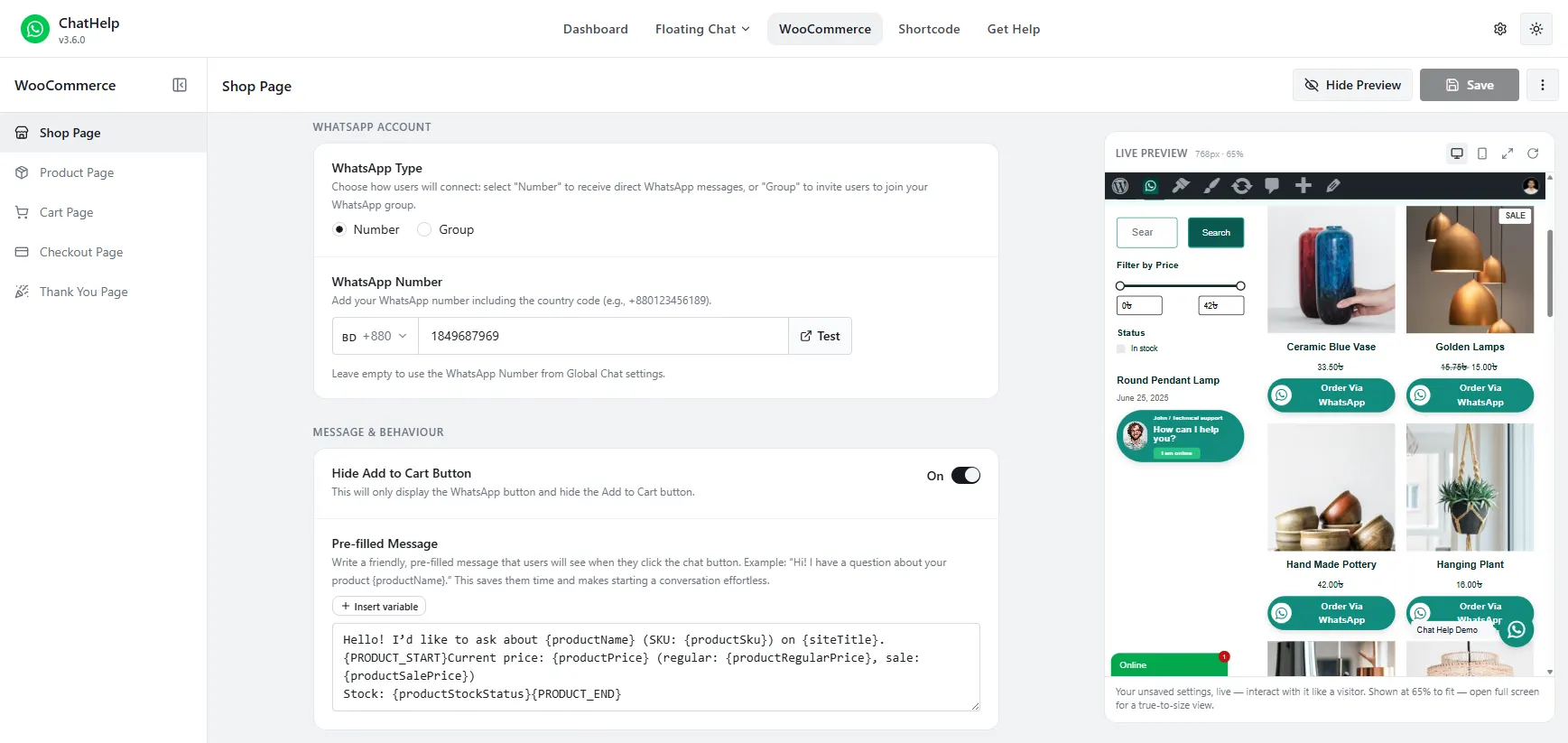
ChatHelp’s product-page button currently supports several placement points, including Before Add to Cart Form, Before Cart Button, After Cart Button, and Product Summary, among others — check your version’s options list, since the set can change. The choice isn’t cosmetic: placing it before add-to-cart resolves uncertainty before purchase; placing it after treats chat as supplementary rather than competing with the purchase decision. Neither wins universally — it depends on how much pre-purchase uncertainty your products actually generate.
A Page-by-Page Placement Map
| Page type | Floating? | Inline CTA? | Suggested placement |
|---|---|---|---|
| Homepage | Usually yes | Rarely needed | Default corner position |
| Product page | Usually yes | Often useful | Near price/specs/add-to-cart decision area |
| Pricing page | Usually yes | Often useful | After the plan comparison |
| Services page | Usually yes | Often useful | After scope and pricing |
| Contact page | Usually yes | Optional | Alongside the contact form, not replacing it |
| Blog post | Selective | Rarely | Only on high-intent, transactional posts |
| Cart | Usually test | Rarely | Avoid competing with the checkout CTA |
| Checkout | Often hide or test carefully | Usually no | Preserve the primary purchase flow |
| Thank-you/order received | Context-dependent | Optional | Order or delivery questions only, not distracting from confirmation |
| FAQ page | Usually yes | Often useful | After the FAQ list, for unanswered questions |
None of these are universal rules — they’re a reasonable starting map to adjust against your own customer journey.
Checkout and Thank-You Pages
Don’t adopt “never show WhatsApp on checkout” as an absolute — some businesses genuinely benefit from assisted checkout. But it can just as easily distract or cover a control at the moment you want focus. A reasonable default: if checkout already works well and most questions resolve earlier, hide or de-emphasize floating chat during final payment, then test against your own business’s actual behavior.
Thank-you and order-received pages aren’t automatically high-value real estate either. Legitimate uses exist — an order question, a delivery clarification — but weigh that against distracting from order confirmation, account setup, or an upsell flow already happening there.
Icon Alone, or Icon Plus Label?
It’s tempting to assume a labelled button always outperforms a bare icon, but there’s no reliable evidence that’s universally true — treat it as testable, not settled. A visible label reduces ambiguity: what happens after the click, roughly who they’ll reach, what kind of question is appropriate. A bare icon saves space, useful on small screens, but leans on icon recognition. Test a bare icon against the same icon plus “Ask a Question,” measured by clicks and conversation quality, not clicks alone.
Accessibility Affects Placement Too
Whether or not you use a visible label, the button needs an accessible name for assistive technology — don’t rely on the icon alone. If building a custom button, use semantic link/button markup with a real accessible name, not a styled <div>.
On sizing, WCAG 2.2’s Target Size (Minimum), 2.5.8 (AA), calls for pointer targets of at least 24 by 24 CSS pixels, with exceptions for spacing, inline text, essential presentation, and equivalent controls. That’s a minimum, not a comfortable size — the separate Target Size (Enhanced), 2.5.5 (AAA), calls for 44 by 44 CSS pixels. A larger mobile target is worth considering, but that’s UX guidance, not an AA requirement — don’t confuse the two levels.
For contrast, Non-text Contrast, 1.4.11 (AA), requires a 3:1 ratio for UI components and graphical objects necessary to understand content — this covers the icon and button shape, separate from the text contrast ratio for any label. Beyond that: the button should be keyboard-reachable, show a visible focus indicator, and never trap focus. If it pulses or slides in, keep the animation restrained, and respect prefers-reduced-motion in custom builds. The goal is attention without annoyance.
Immediate, Delayed, or With a Greeting?
There’s no reliable evidence a delayed appearance universally increases engagement — treat this as testable too. Immediate display is instantly discoverable but can add clutter while a visitor is still orienting. A short delay lets that happen first, but risks feeling like a popup if aggressive. A greeting bubble can explain the CTA before a click, at the cost of screen space. Test immediate against delayed, greeting against none — there’s no evidence-backed ideal delay to default to.
Performance and SEO, Accurately
Floating WhatsApp buttons don’t inherently hurt Core Web Vitals, and fixed buttons aren’t automatically free of cost either — both blanket claims are wrong. Per Google’s own definition, Cumulative Layout Shift measures existing elements changing position between frames; a new element appearing without pushing other content around doesn’t count as a shift under the Layout Instability API. Where a widget can genuinely cost you something is its JavaScript, fonts, avatar images, and third-party resources — real and measurable, so check with PageSpeed Insights or Lighthouse rather than assume.
Google doesn’t penalize a site simply for having a floating WhatsApp button. What matters for SEO is ordinary UX quality: obstruction, accessibility, load performance — the same factors that apply to any fixed-position element, not something specific to WhatsApp.
Testing Placement Without a Lot of Traffic
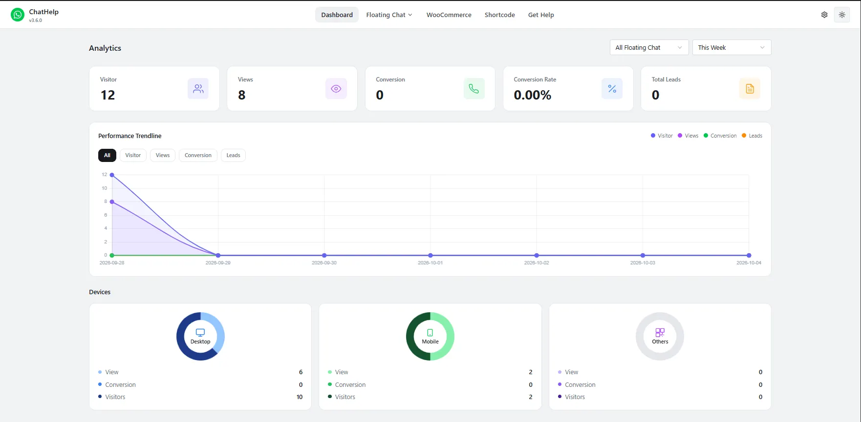
Track sessions on the relevant page type, CTA clicks, click rate, conversations actually started where measurable, and downstream leads or orders — not raw clicks alone. Most small sites lack traffic for a rigorous simultaneous A/B test, so sequential testing works better: baseline, change one variable, run through a comparable traffic period, compare, repeat. There’s no fixed correct duration — traffic, day-of-week effects, and seasonality all change what “long enough” means, so skip the arbitrary “run it for a week” rule.
Change one variable at a time — position, color, label, message, delay — not several together. If everything changes at once, you can’t tell what caused the difference, which matters even more on a low-traffic site.
Two Practical Scenarios
These are illustrative scenarios, not measured case studies.
A WooCommerce store
With a sticky mobile Add to Cart bar, a cookie banner, and real product questions: move the floating button clear of the sticky cart, add an inline CTA around product information where questions form, and de-emphasize chat during checkout.
A service business
With a long service page, pricing, FAQ, and a quote CTA, the strategy looks different: persistent floating chat throughout, one inline CTA after scope-and-pricing, and a second only if the page is exceptionally long with a genuine hesitation point elsewhere. Same framework, different answer, because visitor behavior differs.
Setting This Up with ChatHelp
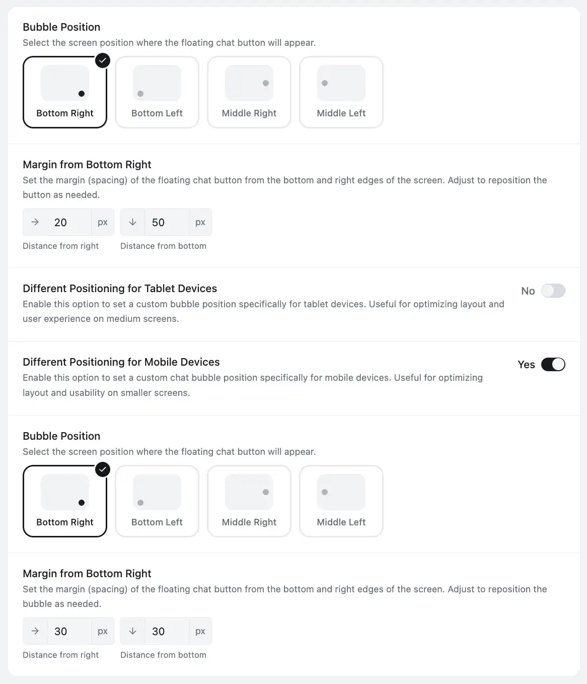
ChatHelp’s floating widget currently supports four screen positions — Bottom Right, Bottom Left, Middle Right, and Middle Left. There’s no bottom-center option in the current product; treat any mention of bottom-center here as a general UI concept, not a ChatHelp setting. Responsive Positioning, a Pro feature, sets a separate position and margin independently for desktop, tablet, and mobile.
For inline placement: a chat_help shortcode for any page or template, a native Gutenberg WhatsApp Button block, and a dedicated Elementor widget. WooCommerce product pages get their own position dropdown, separate from the floating widget, with options including Before Add to Cart Form and After Cart Button — check your version’s exact list, since these change. If the floating widget doesn’t suit a page, you generally have four options: reposition it, swap layouts, hide it there, or show it only where it belongs via page-targeting — a deeper topic than this guide covers.
Common Mistakes
- Floating button covering the primary mobile CTA
- The same placement used blindly across every breakpoint
- Multiple widgets stacked in the same corner
- Never testing with the cookie banner actually visible
- Raising z-index instead of fixing the actual overlap
- A button too small or too close to another control
- Poor icon contrast against the background
- A bare icon with no accessible name
- Aggressive, repeated animation
- A greeting bubble that obscures content
- Inline CTAs repeated after every single section
- Assuming bottom-right is always correct regardless of what else occupies that corner
- Keeping chat prominent through checkout without weighing the distraction
- Changing several test variables at once
Frequently Asked Questions
Is bottom-left or bottom-right better for a WhatsApp button?
Bottom-right is the more common default on left-to-right websites, but it’s a convention rather than a proven conversion winner. Switch to bottom-left when the right corner already holds a sticky cart, back-to-top control, or accessibility widget — context matters more than the corner itself.
Where should I put a WhatsApp button on mobile?
Somewhere clear of sticky add-to-cart bars, consent banners, and navigation, with enough spacing from screen edges to respect device safe areas. There’s no single universal margin that works everywhere, so test the actual placement on real phones rather than relying on a desktop preview.
What is the best position for a chat button?
There isn’t one universal coordinate. The right answer combines screen position (usually a corner, clear of other fixed elements), page position (near where questions actually form), and journey stage (which pages and moments genuinely benefit from a WhatsApp option).
Should a WhatsApp button appear on every page?
Not necessarily. Pages with strong buying or support intent — products, pricing, services, contact — usually benefit. Legal pages, low-intent blog content, or pages where a different action should dominate the visitor’s attention often don’t need it, or need a more limited version.
Should I add WhatsApp below the Add to Cart button?
It can work well if pre-purchase questions are common for that product, since it resolves uncertainty right before the buying decision. If your priority is keeping full attention on the purchase action itself, placing it after the cart button instead treats WhatsApp as supplementary rather than competing with checkout.
Does a floating WhatsApp button hurt Core Web Vitals?
Not inherently. Layout shift is measured against existing content changing position, and a new fixed element appearing without moving anything else doesn’t count against Cumulative Layout Shift. The widget’s JavaScript and resources can still cost something, so measure your actual pages instead of assuming.
Does a WhatsApp button hurt SEO?
Not simply by existing. What matters is ordinary user-experience quality: whether it obstructs content, whether it’s accessible, and whether it meaningfully affects load performance — the same factors that apply to any fixed-position element, not something unique to WhatsApp specifically.
Should the WhatsApp button appear immediately or after a delay?
Either can work, and there’s no reliable evidence a delay universally performs better. Immediate display is more discoverable; a short delay can reduce initial visual clutter but risks feeling intrusive if timed poorly. Test both on your own site rather than assuming one is correct.
Is an icon or a labelled WhatsApp button better?
A label reduces ambiguity about what happens after the click; a bare icon saves space but depends on icon recognition. Neither has reliable evidence proving it universally outperforms the other — test both and measure conversation quality, not just click volume.
The right corner matters, but the right moment matters more. Open your three highest-intent pages on an actual phone and audit where the WhatsApp CTA sits relative to what the visitor is about to decide next. If you’re setting this up on WordPress, the free ChatHelp plugin covers floating positioning, responsive controls, and inline placement through shortcodes, Gutenberg, and Elementor.